Dark Mode or Light Mode? The answer is somewhere in between.
I've been wondering recently if I should add a dark mode to this website. I tend to prefer dark mode and it's typically my default, but my ideal preference isn't one or the other, it's a bit more nuanced and something most apps and websites fail to provide.
The problem I have with most light websites is that they are too white. Blindingly white. Ideally white should be used around specific areas of focus rather than the entire page. This avoids the blinding light when switching between darker and lighter websites. Inversely, dark websites shouldn't be too dark as it causes white text to glare, especially for people with astigmatism. And when there's large blocks of white text, like with articles, the glare merges and multiplies making it tiresome to read.
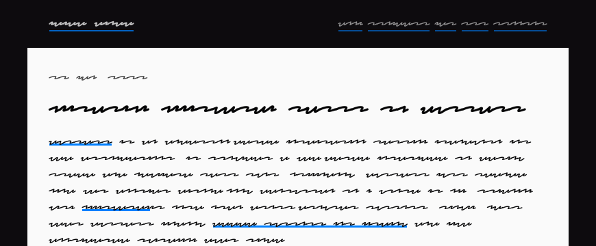
My website tries to follow these preferences. I only use white around the main article, everything else is black.

I could introduce a proper dark mode but then I'd need to maintain more styles and I'll need to add a switcher. More work that gets in the way of me writing. Besides, browsers come with "Reader Mode" now which I try my best to support by keeping the HTML semantically valid. Reader mode has other accessibility features too like customising fonts and text-to-speech. And outside of reader mode, the website's RSS feed contains the full article text so it can be read on any reader. I hope all of that is more than enough.
Thanks for reading.