FrontierNav Weekly: 4th May 2020
This week I've mostly been polishing the user experience. Making it more consistent and predictable rather than requiring foreknowledge on how FrontierNav works.
Changes
- New games can now be added using FrontierNav's interface without direct server access.
- Sidebars now start collapsed on mobile with a button to expand to avoid covering the entire page.
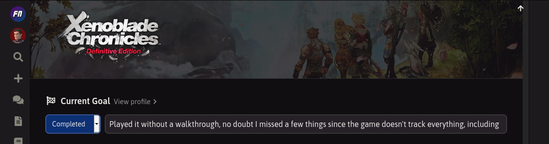
- Moved sidebar controls (bookmark, complete, share) to the toolbar so that it's easier to access without having to scroll to the bottom.
- Lists with too many items now show at least 10 with the rest collapsed, rather than collapsing the entire list.
- Play status on game cards are now ribbons to reduce vertical height.
- Page headings are more clean and less noisy
- Greatly improved consistency of interactable components.
- Increased roundness of components that are interactable.
- Components which take your to new pages are coloured blue. Components that don't are yellow.
- Currently active components are also coloured yellow. Yellow was re-used to avoid too many colours on the page.
- Ensure all interactable components show their specific color on focus/hover.
- Consistent shadows across all UI components.
- Set a maximum width to ACNH's Critter Calendar to avoid it stretching t0o far away from the sidebar.
- Fixed image quality on HiDPI screens.
Adding New Games
This is really the highlight of all the changes this week and a pretty big milestone, but it's greatly overshadowed by the UI consistency changes which are a lot more visible.
Admins (i.e. me) can now add new game databases entirely from FrontierNav's interface. Previously, I had to go into the server to set things up. Thanks too all the migration work, everything is now automated.
The first game to use this approach is Dragon's Dogma, which is a great game I recently started replaying on PC.
Collapsed Sidebar on Mobile
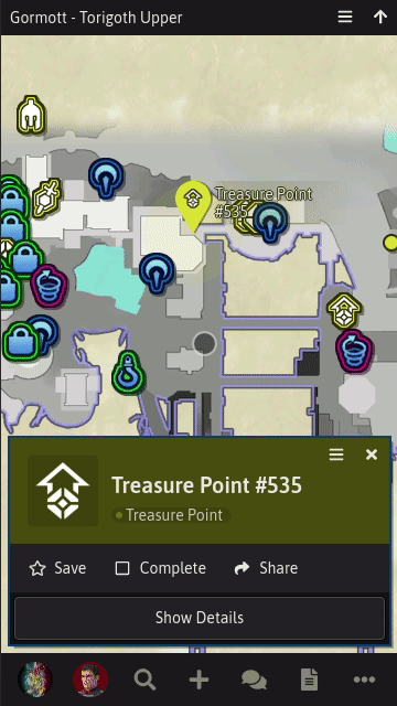
I always found FrontierNav to be a bit awkward to use on mobile. Most of it behaves well, but the sidebar, an integral part of the experience, was annoying. Every link that opened up the sidebar would just cover the whole page, requiring you to close it again to see a visualisation. So if I was clicking through map markers, I had to constantly open and close the sidebar.
The current collapsed view isn't perfect -- I think the expand button could be better presented -- but it works better than before.
Sidebar Toolbar
This was another legacy feature that annoyed me a lot. To mark things as complete I had to scroll the sidebar all the way down to access the controls. It was weird to have top-level controls at the bottom. I avoided moving it earlier because I wasn't sure where the new controls would fit best: below the heading, along the top or to the side. After introducing the toolbar for Merge Requests, I tried out some locations. Placing it in the heading or to the side made it too crammed so the toolbar worked best.
List Expansion
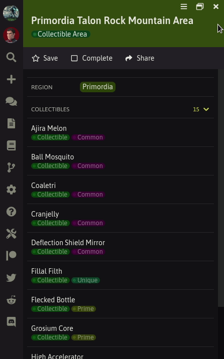
Yet another legacy problem was collapsed lists. Initially, when FrontierNav was just Xenoblade X, it had custom sidebars for everything. Lists were either too long to be immediately useful or short enough to always be useful. So having it entirely collapse or expand worked well. This all-or-nothing approach didn't scale with other games.
Some pages might have 1 item too many and would collapse, while other pages with the same layout would have 1 item less so they'd expand; causing an inconsistency. So now lists show as much as they can, and the rest can be expanded. This also helps make lists more visible compared to showing nothing and hoping people realise the list can be expanded.
Play Status Ribbons
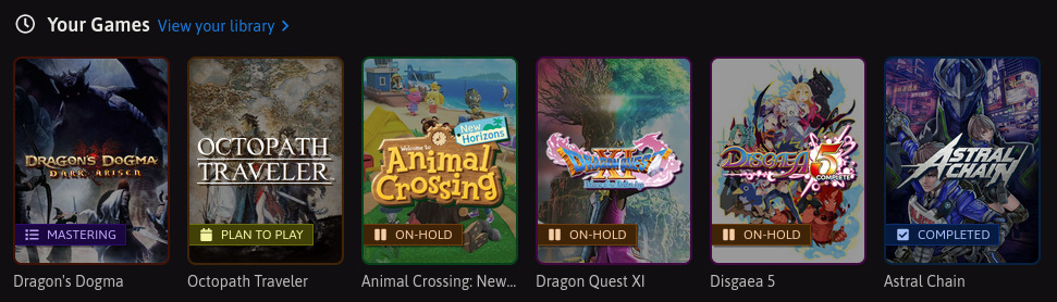
This was more just something I wanted to do because I thought it looked cool but it also helps keep the space taken by games you've played and haven't the same. So again, more consistency.
Clean Page Headings
When I initially introduced the gradient faded page backgrounds I thought it looked good and gave each game a nice "theme". However, it caused a lot of noise and clutter as it conflicted with the focus in the foreground.
The "thumbnail" also didn't work very well as it was too large to be an icon and too small to use the cover art. So I planned to replace it with the game's logo so that it's more immediately recognisable.
Both of these issues are solved now. Just a clean, consistent page heading. I'll apply the same layout for some remaining pages like user profiles in the future.
Interactable Components
One of my pet peeves with a lot of the user interfaces I use is the ambiguity. What does a button do when I click it? Is it even a button? Where are the buttons? So I've used FrontierNav to understand this problem and find a good solution to it.
The solution I've come up with is pretty simple, though required some work to adjust existing components to fit within it. I guess these are FrontierNav's "design guidelines" which I might write up about in more detail later.
There's still some migrations left but the rules for future work is more or less decided.
Roundness
Interactable components are all rounded. I've increased the roundess of all existing components to make it more obvious. Components that aren't interactable are square.
In cases where roundness isn't visible like text and transparent backgrounds, the "Colour" rules apply to distinguish them from non-interactable components. In such cases when hovering over a component, if the colour doesn't cover the entire component, the roundness should be visible either with a background or border.
Colour
All interactable components have a colour. Colour identifies the sort of action the component does. Blue causes a page transition, yellow causes a state transition (i.e. everything else). In addition, yellow is also used to indicate the current state. I initially tried green or purple but the page seemed to colourful and distracting.
In cases where colour is distracting and components are muted, "Calls to Action" rules apply to distinguish them from non-interactable components.
Icons and Calls to Action
To avoid using too much colour, components can use other means to indicate interactions such icons or verbs. In such cases, colour should still be visible when hovering.
Hover and Focus
When an interactable component is focused or hovered over, its view must change to indicate such. Otherwise, the user may not know where they are on the page and if an interaction is available. This can be done by changing colour, background or border.
On desktop the mouse cursor changes its icon for interactions. However, not everyone uses a mouse, a lot of people are using touchscreens, so relying on mouse-specific behaviour can cause problems.
Next Up
Most of the low hanging fruit is complete. Next I'll be improving existing user journeys like making changes, creating merge requests and completion tracking.
Thanks for reading.